
Monday, October 09, 2006
Tuesday, September 26, 2006
Screenies
Here are a few screenshots (mostly recent) from Laila's collection:

Hold me closer tiny dancer ...

Ahh ... that's the spot!

The lost art of tabard dancing
(btw, is that Acathla and Krakken???)

The view from the top
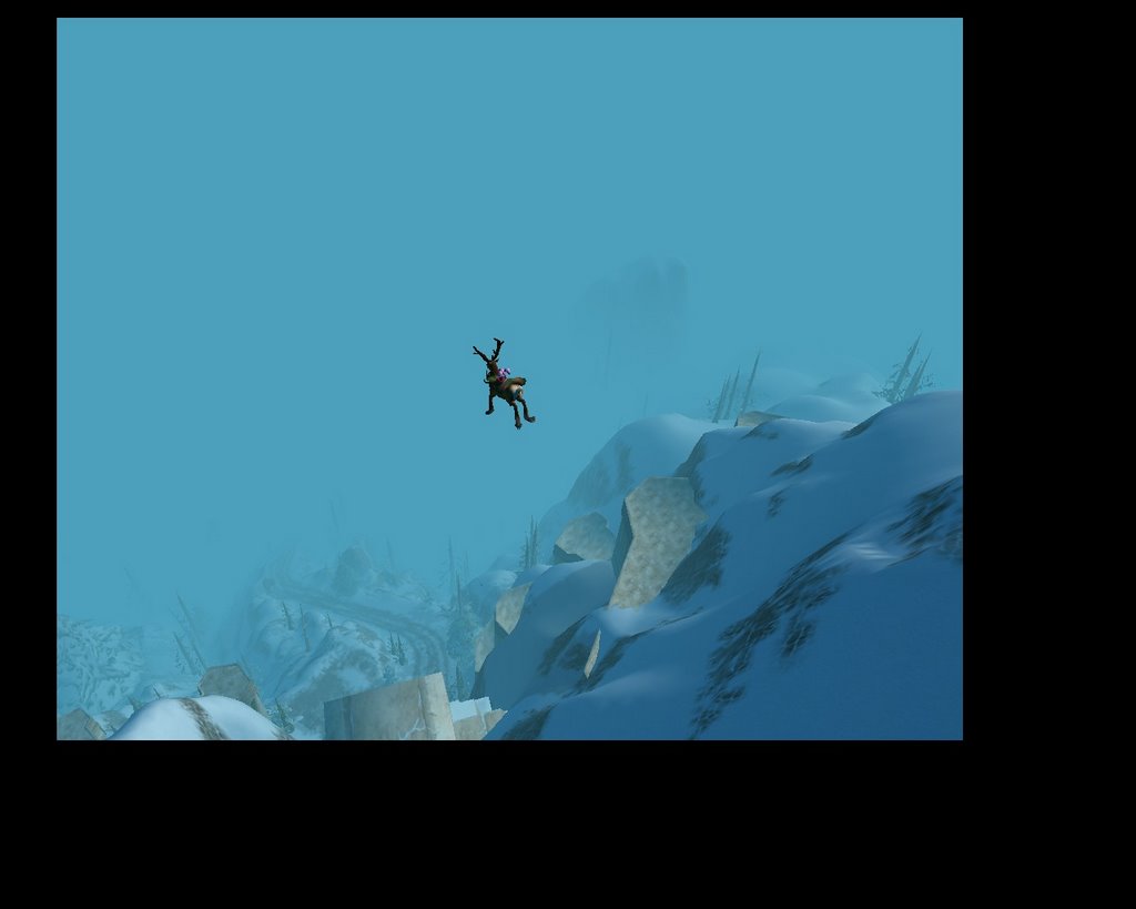
Reindeer really can fly
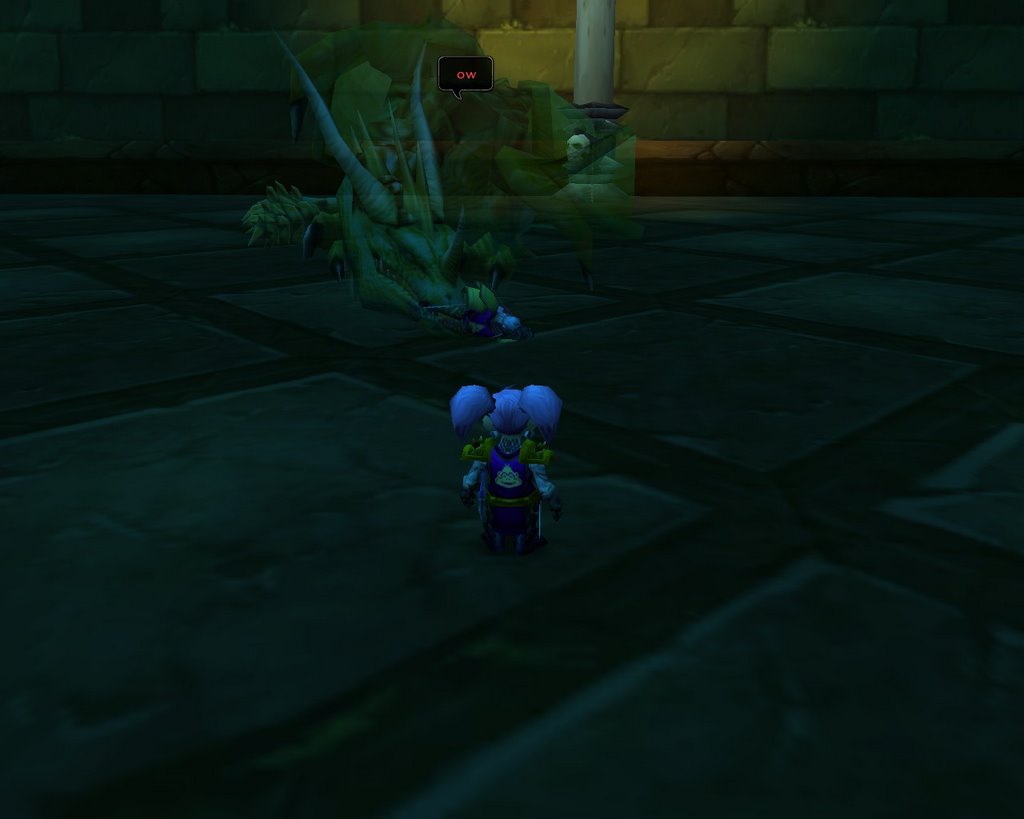
Oww!
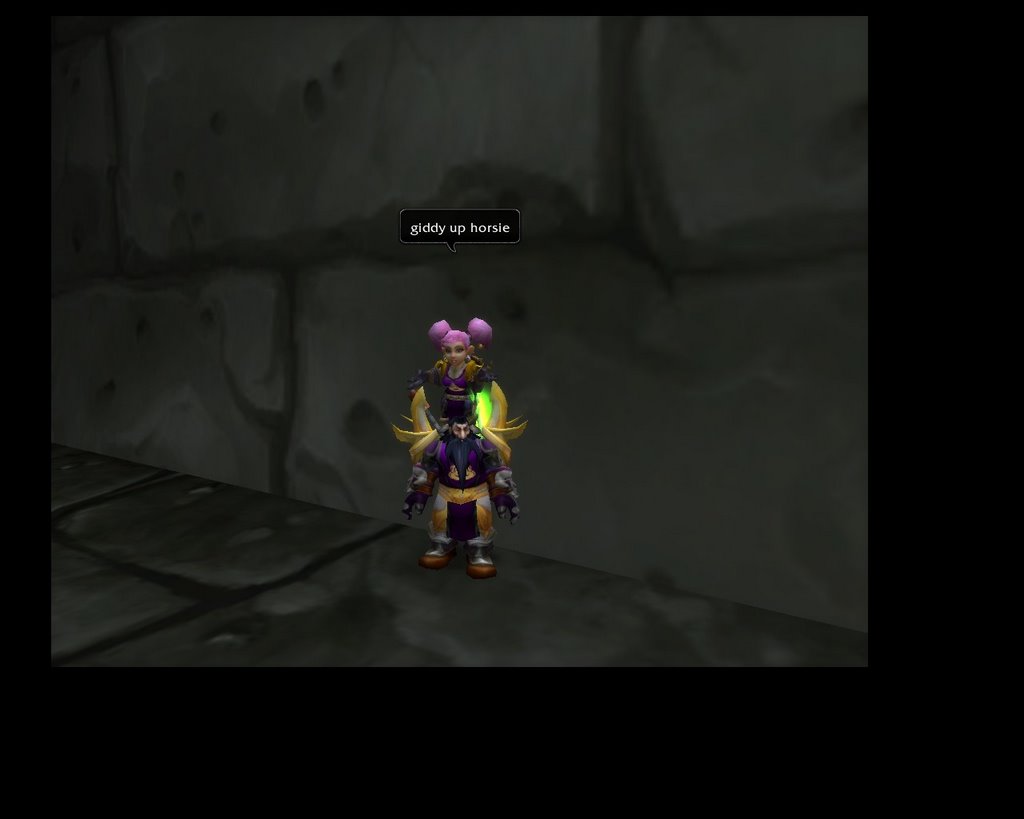
Giddyup!

The Harbie Core!

Dress Brigade

Dress Brigade, Take 2
Wednesday, August 30, 2006
Ed's Custom UI
Okay, here it is – my new UI. This is most definitely a work in progress. I have spent two days working on it so far, and I definitely have the basics. I am going to have to tweak the location of things in parties and raid, for sure, but it’s good to go for soloing.
A few quick notes. It was not that hard for me to do. However, the main mod I am using (Discord Action Bars – more below), I have been using for many months. It was a slow learning curve in the beginning. This ui is built for function, not aesthetics. I like to have a lot of information available to me, but it was getting so I couldn’t see my screen. This is meant to fix that. Okay, first screenshot ...
(Note: I would suggest you right-click on the picture and choose "Open in a New Window." Then you can Alt-tab back and forth between the picture and the discussion, as I explain what you're looking at. This photo is compressed and reduced in size from my monitor, so depnding on your monitor, it may be hard to read some of the smaller fonts. Try and make it as large as you can, and it should be okay.)

That is the basic UI. So what do we have?
The most obvious change is that I have shrunk the playfield. The image is the FULL play screen, I have just shrunk it to about 80% of my screen area. This gives me black "bars" around the edges that I can put my information into more easily. The mod I use is called Viewport, and is available from CT. Very simple to use. I have slightly more black at the right and bottom so I can fit more info in there - it was a little weird at first, since the screen was off-center, but it took like an hour to get used to it.
I run the video at 1280x1024, which is 1.25:1, instead of 1.33:1. I don't know why this works best on my monitor, but it just does, so I go with it.
For comparison purposes, here is a shot of my old UI. Now this shot is actually 3 months old, and my UI got even more comlicated. For instance, I now have 4 chat windows instead of the 2 pictured, I have KTM minimized, etc. (more on this in a minute).
Okay, back to the new UI. The bottom of the screen is now the main area of interaction. For starters, I have 4 chat windows (using standard Blizz windows, but may change these at some point). This UI is totally meant for raiding, and my chats reflect that. Bottom left is whispers (important for taking DKP bids, etc.). Top right is guild (cause we are chatty when we raid). Bottom right is warrior channel and officer channel - important stuff I need to keep my eyes on. Notice that officer and warrior have very different colors, so I can distinguish them. Upper left is everything else, including part, raid, general, trade and BAH.
In the bottom center are my action bars. As you guys know, I am very button dependent. Now, granted, some of these things, like the World Enlarger, do not have to have a shortcut button, but they help. Also, in this shot, there are a number of empty buttons, but those are usually filled (for instance, for this shot I took off 8 announcement macros (45 secs to Sons, etc.) that we use on Rag). Also, I am used to where things are located, so I don't move things aroung too too much.
The program I use is called Discord Action Bars (DAB). This allows you to do pretty much anything you can to a button or bar, and then some. Change size, color, background, outline, font, cooldown counter, hotkey, spacing, number of buttons per bar, vertical, horizontal, number of rows per bar, etc. When I am out of range, the buttons grey out. When I don't have enough rage/mana, they turn red. When a skill is on cooldown, the time left appears on the button. You can program every bar and every button using simple events too. For instance, I have a skill that only activates when I block. If I want, I can make a giant button that appears in the middle of the screen, but only if I block and the skill is cooled down. I only use maybe 25% of the functionality of this mod, and I am still amazed.
The bottom bar is my main bar. This uses the normal main bar hotkeys of 1-= (you can see the keys on the buttons). I have charge, sunder armor, shield slam - all my bread and butter talents. The bar is dynamic, meaning that I have set it up to remap (change skills) when I change stances. For instance, button 3 is currently Overpower, because I am in Battle Stance (Overpower only works in Battle Stance). When I switch to Defensive Stance, that button remaps to Revenge (only available in Defensive Stance). I only remap 3 buttons. This is important. Blizzard offers 10 action bars. In the Blizzard UI, when you shape shift (equal to stance for warrior), the entire bar - all 12 buttons - are remapped. So, using Blizzard's ui, 3 stances takes 36 buttons. Furthermore, if I want a new skill in button #1, I have to change it in all 3 bars (change skill, switch stance, change skill, switch stance, change skill - oy!). With DAB, I only change the buttons I want changed. So, instead of 36 buttons, my 3 bars use 15. That leaves me 21 buttons for other things.
I don't show this in the screenshot, but if I use my mousewheel on the bottom bar, it takes me to my "professions" bar, which is where I put buttons for engineering, smelting, First Aid, Cooking, Fishing, etc.
The next bar up is secondary actions. Shooting, shouts, less used combat skills, etc. I key this as Shift-1 to Shift-= (S-1 to S-= on the bars).
Next bar up I use for combat support. This is normally filled with buffs, potions, sharpening stones, etc. Many of the buttons are currently empty, because I had them filled with macros for Rag. This bar is Ctrl-1 to Ctrl-=.
The fourth bar is even less used things. First are my long-cooldown skills - last stand (10 min) and shield wall and retaliation (both 30 min). I also have AOE taunt, escape from traps, etc. The skills that are here are primarily here due to the historical nature of where this bar was on my old UI when I used to mouse things - and now I am just used to those keys. This is the Alt bar (Alt-1 to Alt-=). I also have some things like mount, find minerals, etc.
The last bar is skills that are hardly ever used, but I need them someplace, just in case. Rend, sunder, Harbe Hearth, Thunder Cats+mount, etc. I use Ctrl+Alt for this bar.
One other important thing to note is the "8 buttons." This is where I put my primary healing. Right now it is mapped with a 1440 HS in Shift-8, A 1320 HS in Ctrl-8, and a 1200 HS in Alt-8. When I have no HS, I put heal pots in these slots. (My heal pots are currently in Alt-7). This makes it really easy to heal myself during battle, because I always know I have healing available in these slots in descending order of potency.
Just to the left near the bottom of the action bars is my stance/shapesift bar. This would be stealth bar for rogue, aura bar (I am pretty sure) for Pally, pet bar for hunter, shapeshift bar for druid, etc. I may have to mess with this for other classes, but I like to have it visible so that I can always see what stance I am in for my warrior. This is also done by DAB, and I made it vertical instead of horizontal.
Other things that DAB controls. Experience bar, latency bar, main bar art - all of which I have hidden. Micro Bar - the bar I have on the left side that has buttons for character, spell book, social, help, etc. I rarely use this, since I use the shortcut keys, but sometimes if I am typing in chat and want to open character screen, for example, I like to have this handy. Bag bar and Keyring button - in this shot, I have these shrunken down and placed on the far right. I usually hide them - so I am testing this out to see how I like it. I will prob hide them again.
Okay, the next easiest thing to explain is the Titan bars. These are the two black (I made them black, normally grey or red) bars at the extreme top and bottom of the screen. Titan is a very powerful mod that puts as much or as little info in a small area as you want. Here are the Titan mods I am running, from left to right:
Top Bar
Loot type - tells what type of looting is active and what the threshhold is (currently Group loot with green threshhold)
JB Roll - Any time someone rolls, it records the rolls, makes a list, and lets you announce with a shift-click. After a minute or so the rolls auto disappear, or you can manually delete.
Reputation - this track one type of reputation on the bar (currently Zandalar). If I mouse over it, a drop-down box appears with honor for every faction.
Performance - currently displayed is frame rate (gold), latency (green/yellow/red, same as latency bar), and total memory used (white)
Clock - nuff said
Regen - shows health and mana regen rate. Since I don't have mana, it only shows HP.
Durability - shows durability of lowest item as a percentage (or number - very customizable). If I mouse over, it does a drop down with all dur, including inventory.
Money+ - on the bar, it shows current gold for this character. On mouse over, it shows gold for all characters, as well as total.
GetDKP - this is the mod I use that allows people to whisper /dkp and get their amount. It shows my current DKP on the bar. If I mouse over, it shows everyone in my class' dkp. Also allows setting of options for GetDKP.
Coordinates - I put this right above mini-map. I rarely use it, but it's there if I need it without having to open the world map.
Bottom Bar
Item Rack - this is the Titan mod for Item Rack. It shows which sets I currently have equipped (Defense and One hand). Left click to show all sets and choose (I keybind mine, so I rarely use this). Right click to open Item Rack options. This is SUPER HELPFUL, since I can see at a glance if I am wearing Fire Resist Gear, Parachute Cloak, etc. without having to open character screen.
Recap - This is the Titan mod for recap. Shows my dmg, group dmg out, and group dmg in (just like when recap is minimized). Not that helpful, but clicking it shows/hides the full recap bar on the screen (which is in screenshot below). I like having it there for easy open/close of recap.
Titan Aggro - not a real useful mod. Tells you when you get aggro. As a tank, it tells me when someone else gets aggro. More useful for 5-man/10-man than raids.
Advanced Timers (ATI) - This is the one that says "no timers". ATI is the mod we use to time repops in MC. On Titan, it shows the timer that is next to expire. If I click it, it brings up the full window. Also allows control, like deleting expired timers.
CT Timer - this is my manual timer (currently shows 00:00:00). Can use to time upwards or countdown. It also appears on the screen on the right side, just above bags. I used to hide this timer, but now that I don't, I will prob eliminate the Titan mod, since it's duplicative.
Item Bonuse - mouse over and it shows how much str, agi, attack power, healing, etc. you get from the items you have equipped. Not super helpful, but I look at it from time to time.
Resistances - Currently shows arcane. Click to change resist type or show all. On the bar, it shows the last attack you took of that kind of dmg (red) and how much you resisted (green). On mouseover, it gives more complete stats, including last 5 attacks.
Ammo count - pretty self-explanatory, except that it also warns me when I get low on ammo (you can change the threshhold).
Bags - shows number of slots used. Left click to open bags (why I usually hide my bag bar).
The gear is a name toggle - click once to turn off all player names, click again for name only, again for name and guild, again for name and rank, again for all 3. Super nice, easy way to toggle names for raids.
The screwdrive shows all skills on mouseover (weapons, defense, professions, etc.)
The final 3 icons just adjust the look of titan bar (opacity, font, etc.)
So That's the end of Titan Bar.
I moved the minimap off the play field - so nice. I also moved tooltips to the upper right hand corner - hooray. They're never in my way anymore.
The two boxes next to the minimap (down and left) are Trinket Menu, more on that in a minute.
The two boxes directly under the minimap is where I moved my buffs. Buffs stack on the right, and debuffs on the left (the debuff is hard to see, because it's fading). I can't wait to see this with 16 buffs!!!! I use the Cosmos Buff mod for this (forget the name). I have every buff showing the name of buff, time left, flashes when below 30 seconds and gives a warning. I may switch these to a smaller format with Discord Frame Manager later, but these work for now.
Next down (green and blue bars) is the party/raid status. This is a new mod I just started using, but it is an adaptation of the Raid Status Box used in CTRA. It is so nice to have this off the edge of the screen. With a full raid, it will have more infor displayed (health and mana). Also shows AFK, offline, dead, etc. counts.
Then is KLH Threat meter. I am the only one currently shown, but it expands down as more people gain threat (provided they're running the mod, of course).
Now, on to the unit frame - the frames that display targets. For these, I used another Discord Mod - Discord Unit Frames or DUF. Like DAB, it is super customizable. The idea was to put as much information on screen as I could get, but make it easy to see and read, without clutter.
Self Frame - Small picture of me, Name, level, class, health and mana bars, with values displayed to the right (will prob add percentage on the bar at some point). In the upper right hand corner, it shows dmg taken, heals, etc. (currently showing -25). The whole background is a translucent green. No buffs or debuffs, since I have these on the right side.
Target frame - Pretty much the same as the self frame, but for a target and "backwards." Background is red for mobs. I think I have it set up to go blue for party, green for friendly, etc. Buffs and debuffs show below him - up to 3 rows of 8 each. Both go from right to left.
Target of Target - The frame just right and down from the target/mob frame is target of target (he's currently targeting me). Background color changes depending on target. Pretty much same set up as the self frame, except smaller, and it shows buffs (two rows on left side below picture from left to right) and debuffs (2 rows, right side, from right to left) - I currently have one budd and one debuff showing (hard to see because it's fading).
Party bars on the left side. Made these like self bar, but a little smaller, and no background, so they didn't cover things up. General set up is same as target of target, including the way buffs/debuffs show up. Pets appear just down and right of character (you can see Gracchu's pet, Chewy), with very minimal information (health and debuffs). One other cool thing I did, but you can't see it here, is add a health bar for the target of every party member. It appears below the buffs for that party member. This allows me to see whether party members are on different targets and how fast the targets are going down - a slimmed-down version of the MT windows in CTRA.
Pet window - not showing, but looks like a small self window, and a little below and offset right from self window. Also has icons for pet happiness and state (in combat, etc.).
Whew - that pretty much covers it for this screenshot. One more to cover a few things, and I'm done.
This screenshot shows what the window looks like with various of the mods "open." Most of these will look familiar, but just in case ...
The top left box is Heal Tracker. Does exactly what it says - tells me who heals me with which spells for how much, including overhealing. I can then send the info to those people or dump the totals to chat a la recap. If you look at the last screenshot, you will see a small black bar above the self frame, which is what it looks like "closed."
The next box to the right is a similar mod, but a Damage Tracker. Tracks all damage, including type and amount resisted, from every mob I ever fight. At the ttop is a red boc that says "All Opponents." When I click that, it open the next box to the right, which allows me to examine damage from individual or multiple mobs (so I can see exactly how much and what kind of damage Rag does to me, for example).
Next right is the Druability drop-down from Titan. This just gives you an idea of what the Titan mods look like when you mouse over them.
By the minimap, you can now see Trinket Menu "opened." The right two boxes are my two equipped trinket slots (can display vertical or horizontal). The left 10 boxes are the other 10 trinkets in my bag. Normally, only the equipped trinkets show, However, if I mouse over them, it shows all trinks, and I can left-click to equip in slot 1 and right-click to equip in slot 2. I can't imagine this being super necessary for non-engineers, but for engineers it is so nice. You can also set up trinket "rotations." So, I prioritize my trinkets. When I use the first one, it goes on cooldown, and Trink Menu swaps in #2. When I use it, it swaps in #3. When #1 cools down, it kicks whatever is equipped and re-equips #1. This would be super helpful in PvP to always have trinkets ready to go.
Lower right is my backpack/bags. I use a program called All-In-One Inventory (AIOI) to show it as one giant pack. If I click the bag bar, Titan Bag or hit B, it opens this. I can also hit Ctrl-B to open individual bags, which I rarely do. There are other bag mods out there, but this one works well enough for me.
In the middle/leftish of screen is Recap. I think most of you know this mod - tracks damage, heals and whatnot. This is open because I clicked on Titan Recap. If I click it again, it will go away.
Bottom center, just above action bars, is the frame for advanced timers. I pull this up in MC if we're trying to figure repop times, then close it back down.
Well, I think that pretty much concludes the tour of my new UI. I really like the concept of viewport to shrink the play screen. Once you do that, there are so many possibilities - like you could put two chat windows alone on the bottom and all bars on the right and left, or something like that. I have seen lots of nice UIs out there, but nothing that would do what I needed, so this is what I came up with. I will be doing some more tweaking in the next week or so (especially in 40-man raids), to figure where I want things and what I want to change (like redoing buff frames), but it will prob stay 90% the same.
I also run a ton of mods that are not discussed or displayed here (Alpha Map, Auctioneer, Gatherer, CT_MailMod, etc.), but this is mostly just about the look-and-feel of my new play set up.
Let me know if you have questions.
A few quick notes. It was not that hard for me to do. However, the main mod I am using (Discord Action Bars – more below), I have been using for many months. It was a slow learning curve in the beginning. This ui is built for function, not aesthetics. I like to have a lot of information available to me, but it was getting so I couldn’t see my screen. This is meant to fix that. Okay, first screenshot ...
(Note: I would suggest you right-click on the picture and choose "Open in a New Window." Then you can Alt-tab back and forth between the picture and the discussion, as I explain what you're looking at. This photo is compressed and reduced in size from my monitor, so depnding on your monitor, it may be hard to read some of the smaller fonts. Try and make it as large as you can, and it should be okay.)
That is the basic UI. So what do we have?
The most obvious change is that I have shrunk the playfield. The image is the FULL play screen, I have just shrunk it to about 80% of my screen area. This gives me black "bars" around the edges that I can put my information into more easily. The mod I use is called Viewport, and is available from CT. Very simple to use. I have slightly more black at the right and bottom so I can fit more info in there - it was a little weird at first, since the screen was off-center, but it took like an hour to get used to it.
I run the video at 1280x1024, which is 1.25:1, instead of 1.33:1. I don't know why this works best on my monitor, but it just does, so I go with it.
For comparison purposes, here is a shot of my old UI. Now this shot is actually 3 months old, and my UI got even more comlicated. For instance, I now have 4 chat windows instead of the 2 pictured, I have KTM minimized, etc. (more on this in a minute).

Okay, back to the new UI. The bottom of the screen is now the main area of interaction. For starters, I have 4 chat windows (using standard Blizz windows, but may change these at some point). This UI is totally meant for raiding, and my chats reflect that. Bottom left is whispers (important for taking DKP bids, etc.). Top right is guild (cause we are chatty when we raid). Bottom right is warrior channel and officer channel - important stuff I need to keep my eyes on. Notice that officer and warrior have very different colors, so I can distinguish them. Upper left is everything else, including part, raid, general, trade and BAH.
In the bottom center are my action bars. As you guys know, I am very button dependent. Now, granted, some of these things, like the World Enlarger, do not have to have a shortcut button, but they help. Also, in this shot, there are a number of empty buttons, but those are usually filled (for instance, for this shot I took off 8 announcement macros (45 secs to Sons, etc.) that we use on Rag). Also, I am used to where things are located, so I don't move things aroung too too much.
The program I use is called Discord Action Bars (DAB). This allows you to do pretty much anything you can to a button or bar, and then some. Change size, color, background, outline, font, cooldown counter, hotkey, spacing, number of buttons per bar, vertical, horizontal, number of rows per bar, etc. When I am out of range, the buttons grey out. When I don't have enough rage/mana, they turn red. When a skill is on cooldown, the time left appears on the button. You can program every bar and every button using simple events too. For instance, I have a skill that only activates when I block. If I want, I can make a giant button that appears in the middle of the screen, but only if I block and the skill is cooled down. I only use maybe 25% of the functionality of this mod, and I am still amazed.
The bottom bar is my main bar. This uses the normal main bar hotkeys of 1-= (you can see the keys on the buttons). I have charge, sunder armor, shield slam - all my bread and butter talents. The bar is dynamic, meaning that I have set it up to remap (change skills) when I change stances. For instance, button 3 is currently Overpower, because I am in Battle Stance (Overpower only works in Battle Stance). When I switch to Defensive Stance, that button remaps to Revenge (only available in Defensive Stance). I only remap 3 buttons. This is important. Blizzard offers 10 action bars. In the Blizzard UI, when you shape shift (equal to stance for warrior), the entire bar - all 12 buttons - are remapped. So, using Blizzard's ui, 3 stances takes 36 buttons. Furthermore, if I want a new skill in button #1, I have to change it in all 3 bars (change skill, switch stance, change skill, switch stance, change skill - oy!). With DAB, I only change the buttons I want changed. So, instead of 36 buttons, my 3 bars use 15. That leaves me 21 buttons for other things.
I don't show this in the screenshot, but if I use my mousewheel on the bottom bar, it takes me to my "professions" bar, which is where I put buttons for engineering, smelting, First Aid, Cooking, Fishing, etc.
The next bar up is secondary actions. Shooting, shouts, less used combat skills, etc. I key this as Shift-1 to Shift-= (S-1 to S-= on the bars).
Next bar up I use for combat support. This is normally filled with buffs, potions, sharpening stones, etc. Many of the buttons are currently empty, because I had them filled with macros for Rag. This bar is Ctrl-1 to Ctrl-=.
The fourth bar is even less used things. First are my long-cooldown skills - last stand (10 min) and shield wall and retaliation (both 30 min). I also have AOE taunt, escape from traps, etc. The skills that are here are primarily here due to the historical nature of where this bar was on my old UI when I used to mouse things - and now I am just used to those keys. This is the Alt bar (Alt-1 to Alt-=). I also have some things like mount, find minerals, etc.
The last bar is skills that are hardly ever used, but I need them someplace, just in case. Rend, sunder, Harbe Hearth, Thunder Cats+mount, etc. I use Ctrl+Alt for this bar.
One other important thing to note is the "8 buttons." This is where I put my primary healing. Right now it is mapped with a 1440 HS in Shift-8, A 1320 HS in Ctrl-8, and a 1200 HS in Alt-8. When I have no HS, I put heal pots in these slots. (My heal pots are currently in Alt-7). This makes it really easy to heal myself during battle, because I always know I have healing available in these slots in descending order of potency.
Just to the left near the bottom of the action bars is my stance/shapesift bar. This would be stealth bar for rogue, aura bar (I am pretty sure) for Pally, pet bar for hunter, shapeshift bar for druid, etc. I may have to mess with this for other classes, but I like to have it visible so that I can always see what stance I am in for my warrior. This is also done by DAB, and I made it vertical instead of horizontal.
Other things that DAB controls. Experience bar, latency bar, main bar art - all of which I have hidden. Micro Bar - the bar I have on the left side that has buttons for character, spell book, social, help, etc. I rarely use this, since I use the shortcut keys, but sometimes if I am typing in chat and want to open character screen, for example, I like to have this handy. Bag bar and Keyring button - in this shot, I have these shrunken down and placed on the far right. I usually hide them - so I am testing this out to see how I like it. I will prob hide them again.
Okay, the next easiest thing to explain is the Titan bars. These are the two black (I made them black, normally grey or red) bars at the extreme top and bottom of the screen. Titan is a very powerful mod that puts as much or as little info in a small area as you want. Here are the Titan mods I am running, from left to right:
Top Bar
Loot type - tells what type of looting is active and what the threshhold is (currently Group loot with green threshhold)
JB Roll - Any time someone rolls, it records the rolls, makes a list, and lets you announce with a shift-click. After a minute or so the rolls auto disappear, or you can manually delete.
Reputation - this track one type of reputation on the bar (currently Zandalar). If I mouse over it, a drop-down box appears with honor for every faction.
Performance - currently displayed is frame rate (gold), latency (green/yellow/red, same as latency bar), and total memory used (white)
Clock - nuff said
Regen - shows health and mana regen rate. Since I don't have mana, it only shows HP.
Durability - shows durability of lowest item as a percentage (or number - very customizable). If I mouse over, it does a drop down with all dur, including inventory.
Money+ - on the bar, it shows current gold for this character. On mouse over, it shows gold for all characters, as well as total.
GetDKP - this is the mod I use that allows people to whisper /dkp and get their amount. It shows my current DKP on the bar. If I mouse over, it shows everyone in my class' dkp. Also allows setting of options for GetDKP.
Coordinates - I put this right above mini-map. I rarely use it, but it's there if I need it without having to open the world map.
Bottom Bar
Item Rack - this is the Titan mod for Item Rack. It shows which sets I currently have equipped (Defense and One hand). Left click to show all sets and choose (I keybind mine, so I rarely use this). Right click to open Item Rack options. This is SUPER HELPFUL, since I can see at a glance if I am wearing Fire Resist Gear, Parachute Cloak, etc. without having to open character screen.
Recap - This is the Titan mod for recap. Shows my dmg, group dmg out, and group dmg in (just like when recap is minimized). Not that helpful, but clicking it shows/hides the full recap bar on the screen (which is in screenshot below). I like having it there for easy open/close of recap.
Titan Aggro - not a real useful mod. Tells you when you get aggro. As a tank, it tells me when someone else gets aggro. More useful for 5-man/10-man than raids.
Advanced Timers (ATI) - This is the one that says "no timers". ATI is the mod we use to time repops in MC. On Titan, it shows the timer that is next to expire. If I click it, it brings up the full window. Also allows control, like deleting expired timers.
CT Timer - this is my manual timer (currently shows 00:00:00). Can use to time upwards or countdown. It also appears on the screen on the right side, just above bags. I used to hide this timer, but now that I don't, I will prob eliminate the Titan mod, since it's duplicative.
Item Bonuse - mouse over and it shows how much str, agi, attack power, healing, etc. you get from the items you have equipped. Not super helpful, but I look at it from time to time.
Resistances - Currently shows arcane. Click to change resist type or show all. On the bar, it shows the last attack you took of that kind of dmg (red) and how much you resisted (green). On mouseover, it gives more complete stats, including last 5 attacks.
Ammo count - pretty self-explanatory, except that it also warns me when I get low on ammo (you can change the threshhold).
Bags - shows number of slots used. Left click to open bags (why I usually hide my bag bar).
The gear is a name toggle - click once to turn off all player names, click again for name only, again for name and guild, again for name and rank, again for all 3. Super nice, easy way to toggle names for raids.
The screwdrive shows all skills on mouseover (weapons, defense, professions, etc.)
The final 3 icons just adjust the look of titan bar (opacity, font, etc.)
So That's the end of Titan Bar.
I moved the minimap off the play field - so nice. I also moved tooltips to the upper right hand corner - hooray. They're never in my way anymore.
The two boxes next to the minimap (down and left) are Trinket Menu, more on that in a minute.
The two boxes directly under the minimap is where I moved my buffs. Buffs stack on the right, and debuffs on the left (the debuff is hard to see, because it's fading). I can't wait to see this with 16 buffs!!!! I use the Cosmos Buff mod for this (forget the name). I have every buff showing the name of buff, time left, flashes when below 30 seconds and gives a warning. I may switch these to a smaller format with Discord Frame Manager later, but these work for now.
Next down (green and blue bars) is the party/raid status. This is a new mod I just started using, but it is an adaptation of the Raid Status Box used in CTRA. It is so nice to have this off the edge of the screen. With a full raid, it will have more infor displayed (health and mana). Also shows AFK, offline, dead, etc. counts.
Then is KLH Threat meter. I am the only one currently shown, but it expands down as more people gain threat (provided they're running the mod, of course).
Now, on to the unit frame - the frames that display targets. For these, I used another Discord Mod - Discord Unit Frames or DUF. Like DAB, it is super customizable. The idea was to put as much information on screen as I could get, but make it easy to see and read, without clutter.
Self Frame - Small picture of me, Name, level, class, health and mana bars, with values displayed to the right (will prob add percentage on the bar at some point). In the upper right hand corner, it shows dmg taken, heals, etc. (currently showing -25). The whole background is a translucent green. No buffs or debuffs, since I have these on the right side.
Target frame - Pretty much the same as the self frame, but for a target and "backwards." Background is red for mobs. I think I have it set up to go blue for party, green for friendly, etc. Buffs and debuffs show below him - up to 3 rows of 8 each. Both go from right to left.
Target of Target - The frame just right and down from the target/mob frame is target of target (he's currently targeting me). Background color changes depending on target. Pretty much same set up as the self frame, except smaller, and it shows buffs (two rows on left side below picture from left to right) and debuffs (2 rows, right side, from right to left) - I currently have one budd and one debuff showing (hard to see because it's fading).
Party bars on the left side. Made these like self bar, but a little smaller, and no background, so they didn't cover things up. General set up is same as target of target, including the way buffs/debuffs show up. Pets appear just down and right of character (you can see Gracchu's pet, Chewy), with very minimal information (health and debuffs). One other cool thing I did, but you can't see it here, is add a health bar for the target of every party member. It appears below the buffs for that party member. This allows me to see whether party members are on different targets and how fast the targets are going down - a slimmed-down version of the MT windows in CTRA.
Pet window - not showing, but looks like a small self window, and a little below and offset right from self window. Also has icons for pet happiness and state (in combat, etc.).
Whew - that pretty much covers it for this screenshot. One more to cover a few things, and I'm done.

This screenshot shows what the window looks like with various of the mods "open." Most of these will look familiar, but just in case ...
The top left box is Heal Tracker. Does exactly what it says - tells me who heals me with which spells for how much, including overhealing. I can then send the info to those people or dump the totals to chat a la recap. If you look at the last screenshot, you will see a small black bar above the self frame, which is what it looks like "closed."
The next box to the right is a similar mod, but a Damage Tracker. Tracks all damage, including type and amount resisted, from every mob I ever fight. At the ttop is a red boc that says "All Opponents." When I click that, it open the next box to the right, which allows me to examine damage from individual or multiple mobs (so I can see exactly how much and what kind of damage Rag does to me, for example).
Next right is the Druability drop-down from Titan. This just gives you an idea of what the Titan mods look like when you mouse over them.
By the minimap, you can now see Trinket Menu "opened." The right two boxes are my two equipped trinket slots (can display vertical or horizontal). The left 10 boxes are the other 10 trinkets in my bag. Normally, only the equipped trinkets show, However, if I mouse over them, it shows all trinks, and I can left-click to equip in slot 1 and right-click to equip in slot 2. I can't imagine this being super necessary for non-engineers, but for engineers it is so nice. You can also set up trinket "rotations." So, I prioritize my trinkets. When I use the first one, it goes on cooldown, and Trink Menu swaps in #2. When I use it, it swaps in #3. When #1 cools down, it kicks whatever is equipped and re-equips #1. This would be super helpful in PvP to always have trinkets ready to go.
Lower right is my backpack/bags. I use a program called All-In-One Inventory (AIOI) to show it as one giant pack. If I click the bag bar, Titan Bag or hit B, it opens this. I can also hit Ctrl-B to open individual bags, which I rarely do. There are other bag mods out there, but this one works well enough for me.
In the middle/leftish of screen is Recap. I think most of you know this mod - tracks damage, heals and whatnot. This is open because I clicked on Titan Recap. If I click it again, it will go away.
Bottom center, just above action bars, is the frame for advanced timers. I pull this up in MC if we're trying to figure repop times, then close it back down.
Well, I think that pretty much concludes the tour of my new UI. I really like the concept of viewport to shrink the play screen. Once you do that, there are so many possibilities - like you could put two chat windows alone on the bottom and all bars on the right and left, or something like that. I have seen lots of nice UIs out there, but nothing that would do what I needed, so this is what I came up with. I will be doing some more tweaking in the next week or so (especially in 40-man raids), to figure where I want things and what I want to change (like redoing buff frames), but it will prob stay 90% the same.
I also run a ton of mods that are not discussed or displayed here (Alpha Map, Auctioneer, Gatherer, CT_MailMod, etc.), but this is mostly just about the look-and-feel of my new play set up.
Let me know if you have questions.
Sunday, July 02, 2006
A Brave New Day
Due to some rather disturbing occurrences in the HGA of late, The Harbies, in conjunction with Beyond Eternity, and Nordrasil Sempervians are forming Brave Adventurers of Hyjal. Brave Adventurers of Hyjal, or BAH, is essentially the same rule set and dkp setup as the “pre-insanity” HGA. BAH will provide the same Sat/Sun main raid, Ony when avail, ZG and AQ20 on weeknights, banking of cores/leather/DI ore, and single dkp set (compiled on 40 man runs only) that we are all used to and have planned for. Fairness, Stability, and Quality leadership. It promises to be a lot of fun. The BAH website is still under construction; the dkp database is up but is not accessible to the public as of this printing. I am told it will be available when the website goes live, but it is being updated after every run, viewable or not. BAH Officers at this time are as follows: Arthan/Larigan, Articfox/Drfoxy, Laila, Neafrina/Temerity … I believe there will be a couple more soon. With any luck we’ll pwn Ragnaros within the next month and be able to actually consider a serious run at BWL. So much to do, so much fun to have doing it. For those that favor stability and fun please join us in game= /join bah .
I’ll see you there,
-Wolf-
I’ll see you there,
-Wolf-
Monday, June 12, 2006

Sunday, June 04, 2006
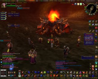
That is a BIG guy!
 Well, we finally have started to get through The Molten Core fast enough to get a run at the big boss. Home Boy is HUGE! This screenie doesn't cover it, he's gotta be 10-15 stories tall, at scale, no joke. And he hits for a ton, 6000 pts in one hit (no I didn't live, and yes my fire resistance sucks). But the fun! After 6 attempts (yes you read that right) we managed t0 get him to 55% before he despawned for the night. Which considering how new most of us were to this fight (myself especially) was actually really good. Well we'll make another run at him next week for sure. Tomorrow we're gonna whip Ony's rear again to make ourselves feel better. Ya almost feel sorry for her..... NOT!
Sunday, May 21, 2006
And down goes Onyxia

Well after a two week game vacation to handle some real life junk, Wolfy managed to get in on the HGA's first downing of Onyxia! For as many times as we had failed attempting the big black dragon of Dustwallow Marsh I would have thought our first success would have been much "closer". But quite frankly, we handled her! It was a blast, with not even 40 people (35 I think) and the highest the "dead" counter reached was 2 I believe! It was unreal, and seemed altogether to easy. And the loot! OMG! Wolfy took a shot and came away with the Dragonstalker helm! Tier 2 WOOT! Not to mention it looks WAY cool! Having completed Ony in a relatively short time frame, we took that momentum and rolled through the first 5 bosses in MC before respawns and Shazz finally culled our reign of terror. At one point the TS even erupted in laughter over a innuendo loaded sentence, and the more that they tried to correct the statement the funnier it got! We had a blast, if only every run could go this smoothly and be this much fun! What a blast! Allyn got his Lawbringer shoulders, Scorpiomoon received her Flarecore Mantle, and I think there was another HoS loot... But alas I can't remember.
I can't speak for anyone else but that was the funnest HGA raid I've ever been on, and I hope they continue this way! Gratz to Neafrina, Laila, and Articfox on a well run and very fun raid.
Thursday, March 30, 2006
Gehennes, you've been PUNKED!
So many snakey dudes, so little time... Wolfy, Laila, Balt, Allyn, Scorpio, and Blog hooked up with thier buddies in the HGA for alittle Molten Core. After witnessing the HGA's first ever felling of Magmadar on Sunday, we returned to the Core on Monday for this snake and his two gaurds. We flat pwned this dude! Blog even landed the kill shot! I'm telling ya, good fight, good loot, and more progress for the HGA! Our strongest showing yet!
Monday, March 06, 2006
Professions - Engineering
Whenever anyone asks me why I decided to become an engineer, I just point out that any profession that allows you to create a chicken that is bigger than you, is a truly sarcastic profession.


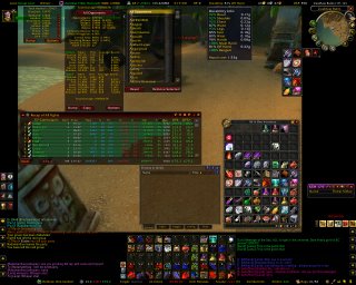
Laila's Crazy UI
I know everyone likes to have their own UI. For me, I like to have access to lots of different types of information that I can dissect (either on th efly or later). I also have lots of spells, talents, trinkets, potions, etc. that I use and like to keep handy. But, despite wanting to have all of these things available, I also like to have the center of my screen relatively clear, so that I have a good view of what's going on.
My solution has been a combination of (1) lots of buttons/mods, (2) high screen resolution, (3) UI scale reducation, (4) eliminating unnecessary graphic elements (such as borders around character frames) and (5) pushing everything to the side. This UI is a work-in-progress (for instance, that cluster of buttons on the right side of the screen below the min-map will disappear as soon as I can figure out how to get Discord to bring them back with a keystroke), but it gives you an idea of what an information-heavy UI looks like.

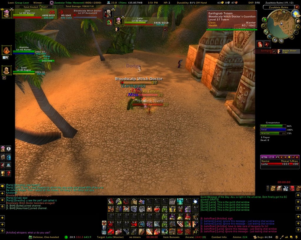
This is my UI in a 40-man raid. Not many changes, but you can see what information I display from CTRA on the left-hand side and how I really compact everything.

Now compare these to 2 screenshots of Timmer's UI (non-raid and raid versions). Notice how he has a lot less information on the screen (and a LOT fewer buttons), but chooses to display everything much larger and allows it to intrude much further into the middle of the screen.


Anyway, that is one of the great things about WoW - our ability to set up our screens in whatever manner is best for us. These probably represent 2 extremes on a couple of different sliding scales, and neither may work for you, but maybe they will give you some ideas about how to make your own UI more useable for you.
By the way, if you have any questions about any of the mods or information displays that you see on my UI, just drop me a message and I can tell you what they are, what they do, and where you can get them.
My solution has been a combination of (1) lots of buttons/mods, (2) high screen resolution, (3) UI scale reducation, (4) eliminating unnecessary graphic elements (such as borders around character frames) and (5) pushing everything to the side. This UI is a work-in-progress (for instance, that cluster of buttons on the right side of the screen below the min-map will disappear as soon as I can figure out how to get Discord to bring them back with a keystroke), but it gives you an idea of what an information-heavy UI looks like.

This is my UI in a 40-man raid. Not many changes, but you can see what information I display from CTRA on the left-hand side and how I really compact everything.

Now compare these to 2 screenshots of Timmer's UI (non-raid and raid versions). Notice how he has a lot less information on the screen (and a LOT fewer buttons), but chooses to display everything much larger and allows it to intrude much further into the middle of the screen.

Anyway, that is one of the great things about WoW - our ability to set up our screens in whatever manner is best for us. These probably represent 2 extremes on a couple of different sliding scales, and neither may work for you, but maybe they will give you some ideas about how to make your own UI more useable for you.
By the way, if you have any questions about any of the mods or information displays that you see on my UI, just drop me a message and I can tell you what they are, what they do, and where you can get them.
Tuesday, January 10, 2006
Some More History
I was cleaning out the office, and I came across some old notes on WoW. Kind of like Wolfie's old tabard dancing pictures. In the same vein, here are some of the proposed, but discarded, names for our guild:
There were 2 dozen others, but those are all I have on the list I found today.
- Buff My Monkey (okay, not technically discarded - BANNED!!!)
- 8" Diablo & The Merry Men
- Buff My Panda (a theme?)
- Insert Guild Name Here
- Is That A Dagger In Your Pocket ...
- and, as we may remember, Acathla's favorite: Buffed Up Party Boys (which I think was some how left over from the "Girls of Melrose" days
There were 2 dozen others, but those are all I have on the list I found today.
Monday, January 09, 2006
Epic!
Well, Wolfy finally made it to the Molten Core. Incorrigible Guild has put together a high-end raid alliance that focuses on fairness in loot and the fun of the game. So with that foundation laid Wolfy, Balt, Laila, and Allyn all went to the MC over the weekend. This is a screen of Wolfy in pre-run trim.

First epic to drop was the tier 2 hunter specific Giantstalker Belt. Wolfy had a 100 DKP to spend, and went all in. Another hunter went all in at 100 as well, and with Wolfy being the same rank it turned into a roll off. We tied on the roll... tie breaking roll went to Wolf! YES!

...as it turned out, this would be the only epic to drop on this run as we wiped 3 times at Luci...
A couple things of note though: It was a blast, it was fair, and I will definately do it again (the run that is). Also my old belt was not to shabby for a blue, a quick look at comparable stats from photo to photo shows how decent the blue actually is...
Happy adventuring!
Subscribe to:
Posts (Atom)